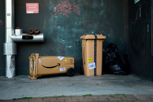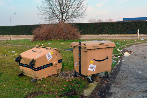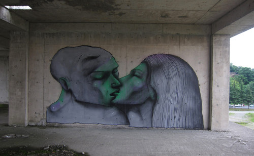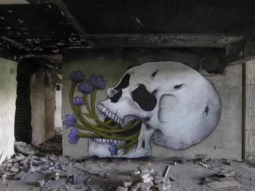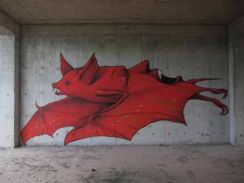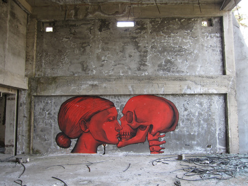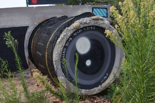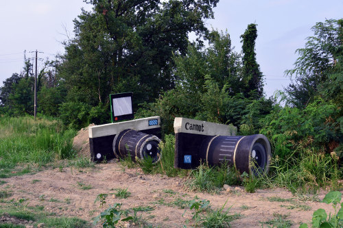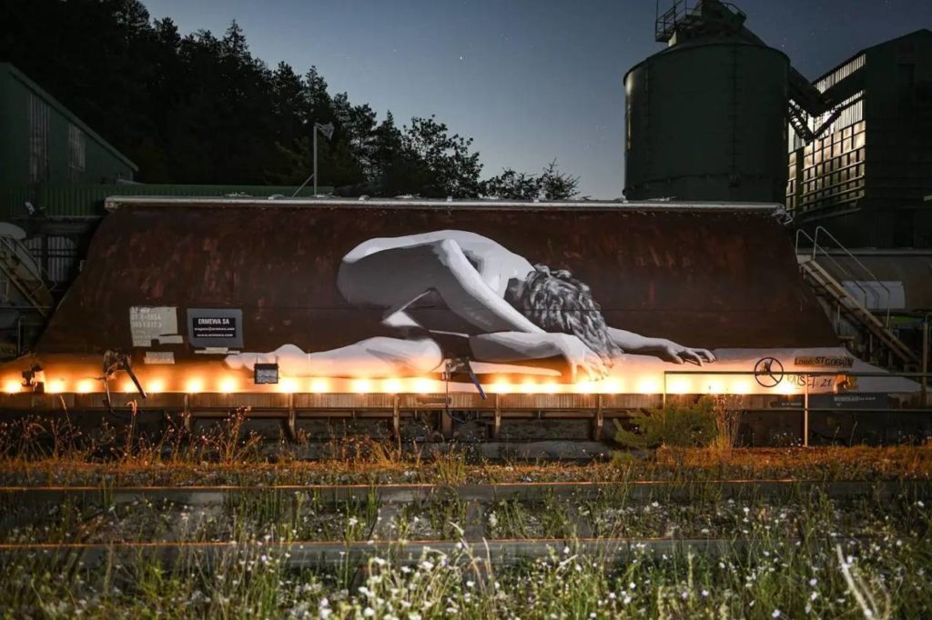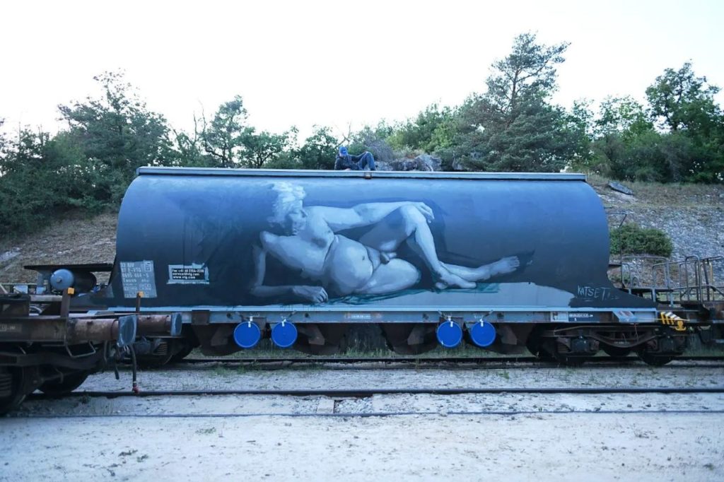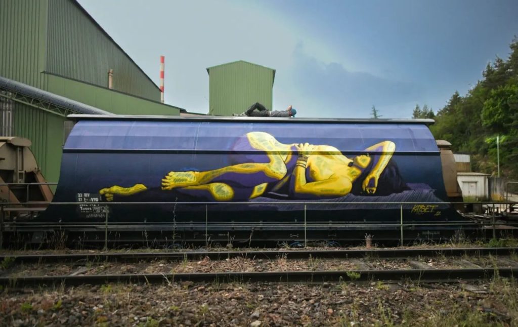
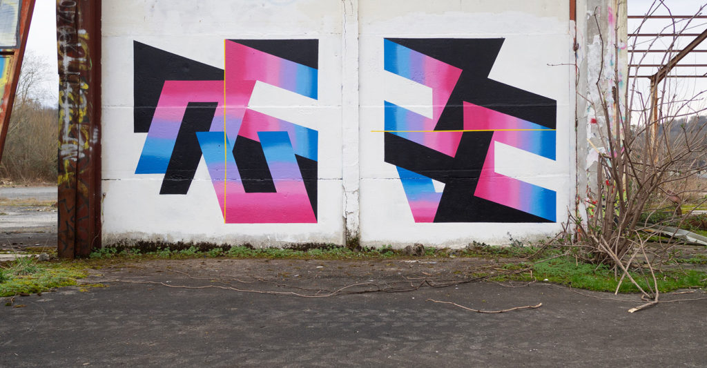
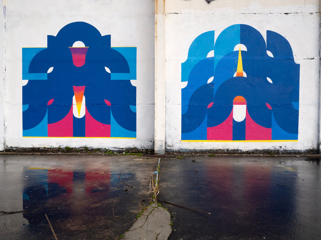
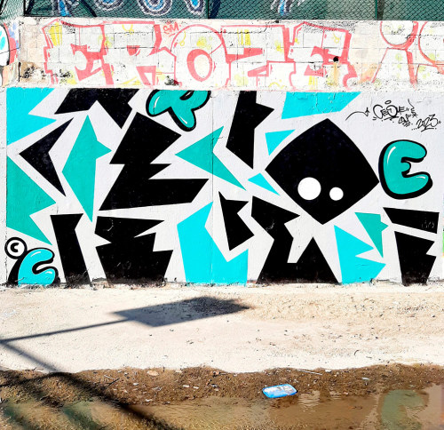
One is never better served than by himself ! 35 new walls from myself -eko-

Graffiti, Post-graffiti and Street-art
The fact that you sacrifice everything for your painting is what interests me the most; the fact that you have some kind of artistic goal and you’re willing to sacrifice your whole life, your family life, your parents, spend all your money just for your passion.
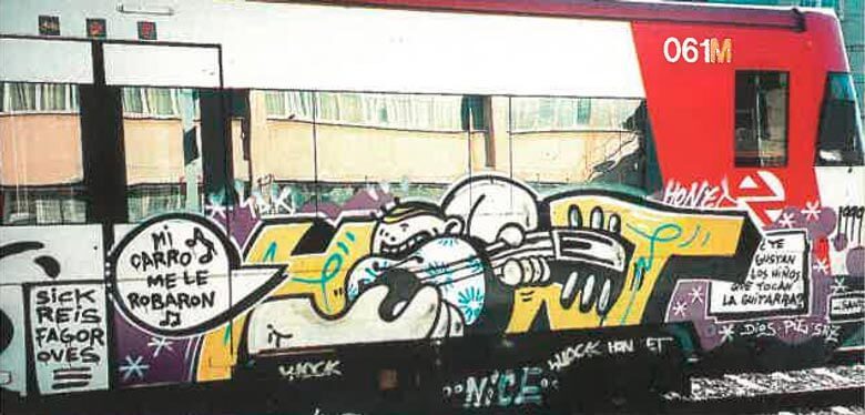
HoNeT interview at mtn-world.com
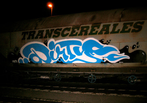
Dirty is actually clean.
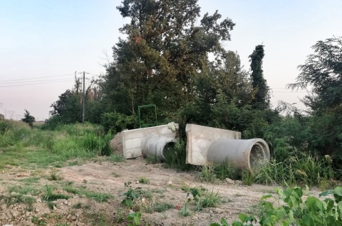
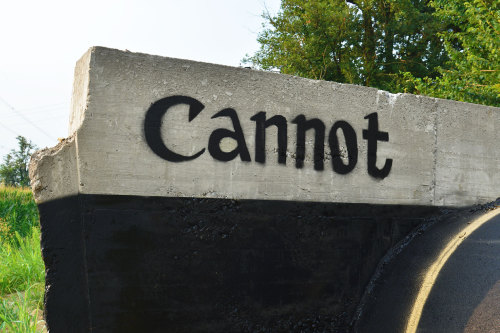
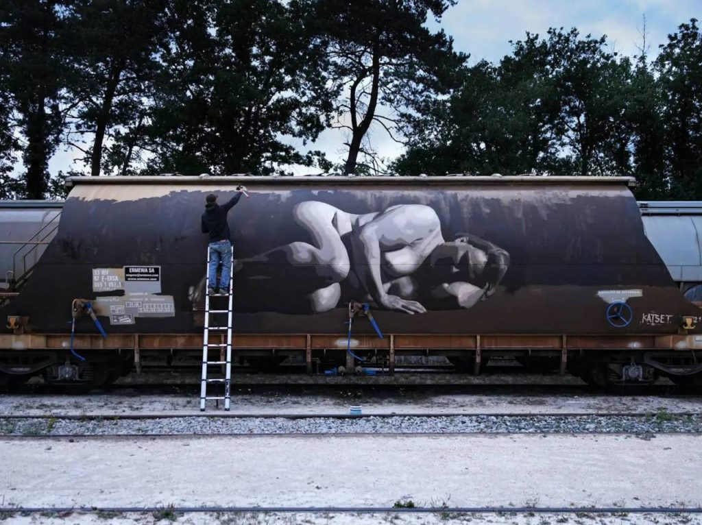
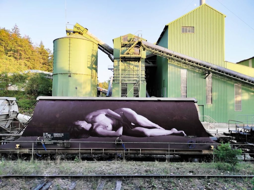
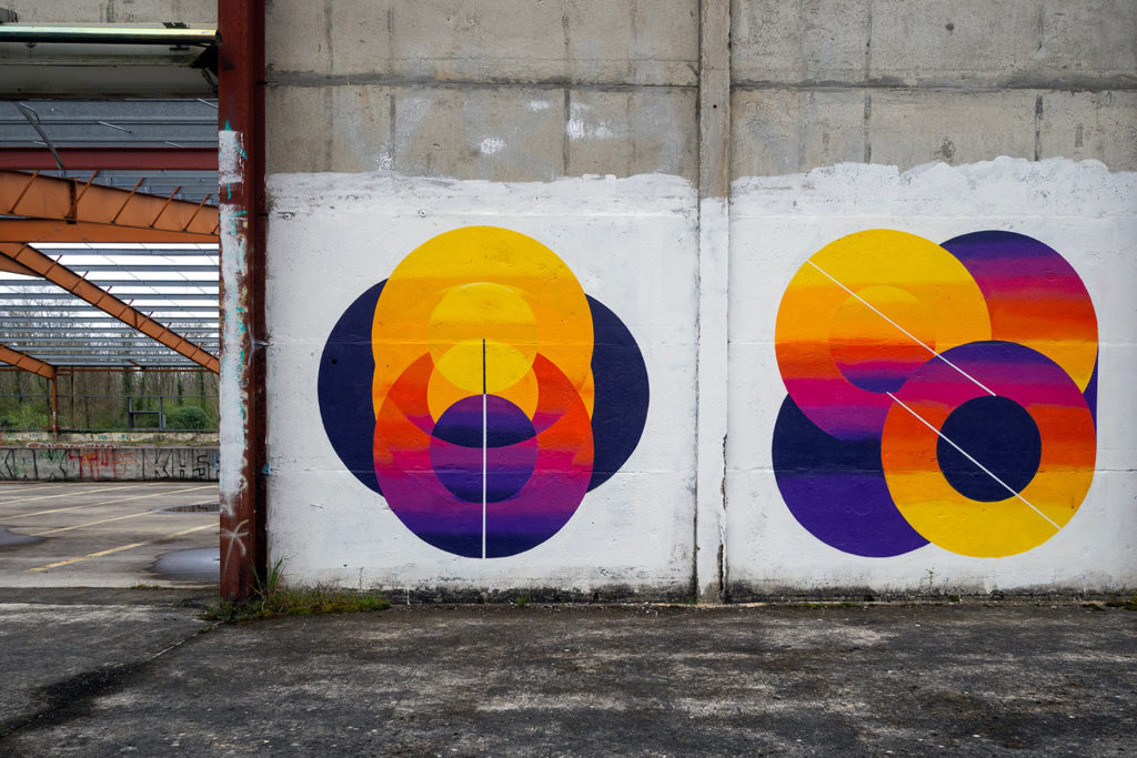
A few new photos from CRE.
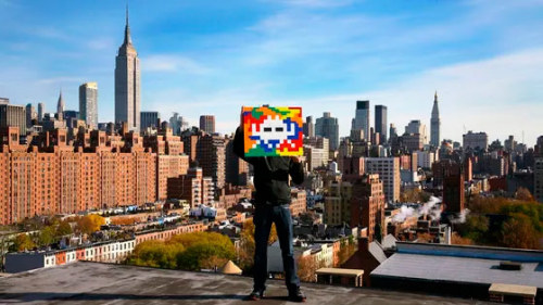
Invader : “Chaque mosaïque est une œuvre en même temps qu’elle est le fragment d’un méta-réseau planétaire”
Très rare discussion de près d’une heure avec Invader sur France Culture.
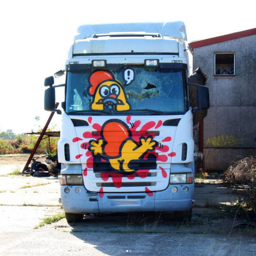
Podcast avec Monsieur Poulet (fonce #18)